

Immoral Compass
Immoral Compass
parasitic cartography and anticapitalist atlases


I recently bought a rusty old car that had been sitting in a barn in Vermont for a decade or so. It was owned previously by a 102-year-old professor, I’m told, and no one had cleaned it out since. When I opened the trunk, I found an atlas and a stack of handwritten directions, page after page of them. It all felt highly personal to look at, overly intimate: these dozens of trips and destinations, proof of someone who had once moved, and now does not.
I won’t leave notes like this behind. I was reminded of this the other day as I traced out a route on Google Maps, watching the interface pinpoint my address and suggest, based on the time of day, where I might like to drive. When I was a kid, I once scrolled through a quilt of satellite images to find our house on Google Earth. My sister and I ran outside to wave at the cameras in the sky, thinking that it was all being streamed live to our computer screen. It was a dazzling thought, then.
Last week, Google Maps celebrated Earth Day by rolling out some new features. Soon, when you route a trip, you’ll be given a choice: You can take the route that, according to some opaque calculation, minimizes your car’s carbon emissions or, instead, continue on your way.
Choices like this exist in a sort of logical trap. That is, yes, at that exact moment you are presented with these options, as you burn up petrol in a car, following a route charted by a behemoth company that spews four million tons of carbon annually—at that precise moment—it is probably slightly better to choose the “eco-friendly” route. Where does that leave us? You’ll be following the directions Google has provided you, regardless.
Our current digital cartography presumes a constant scarcity of information, and, in turn, offers a slew of unneeded solutions. Google’s relationship with the environment is the perfect example of this. Other of Google Maps’ celebratory Earth Day features allow businesses to list the types of recycling they offer, the different “sustainable” practices they employ. These ersatz options are like the fallacy of recycling, encoded. The systemic, when broken down into personal choices, remains manageable and unchanged. The plastic will still end up in the ocean.
Obscured by informational filters is the map’s role as a broker: mediating transactions according to its own rules. In a study of Google Maps’ presence in the favelas of Rio de Janeiro, Andres Luque-Ayala writes of an “automatic production of space,” wherein software creates geography, over and over again. Digital mapping, particularly in informal urban spaces, he argues, is “an exercise in producing territory”—asserting political and economic control over a place, rather than reflecting local knowledge. Luque-Ayala found, for instance, that the mapping project improved traffic for business in only the wealthiest favelas; further evidence that such technologies “only reproduce existing urban fragmentations.”
We see this function in the ways that digital mapping replicates environmental injustice. Google Maps has recently promised to work with cities to support “low-emission zones”—urban areas with restrictions on carbon emissions. While such policies have in some cases proved effective at reducing pollution within circumscribed zones (typically city centers), they also distribute those benefits unequally, tending to “benefit the more affluent,” according to one study, directing traffic and fumes through poorer neighborhoods instead.
And yet, the digital map is ever-expanding, constantly encroaching. It monitors traffic patterns, regulates public transport, and directs local economies. Google’s imperial plans for a “smart city” in Toronto may have collapsed, but its mapping projects have created similar infrastructure globally. The world that “smart city” ideologues endorse, after all, is one that is perfectly mapped.
We often imagine maps as a supply of information, scientific and unquestioned. But even before Google’s particularly parasitic cartography, geographers like Brian Harley had theorized mapmaking as surveillance. In Harley’s view, maps were receptors of information. They served state power not only by drawing borders, but by monitoring what lay within them. “The more pervasive [the state’s] territorial and social ambitions,” he wrote, “then the greater its appetite for maps.”
Cast under this light, Google’s immense street view project (which has captured tens of millions of miles of panoramic footage of public streets) feels far more sinister. Indeed, the street view precursor “Aspen Movie Map,” the first such hypermedia project, was funded by the U.S. Department of Defense, which envisioned the use of virtual mapping to familiarize soldiers with new terrain. Fundamentally, the technology invites boots on the ground.
Harley concludes that maps are “preeminently a language of power, not of protest.” This occurs on large scales—enforcing state borders, say—but on smaller ones, too. In the city of Winooski, Vermont, for instance, faulty noise maps crafted by the FAA underestimate the decibel levels produced by the fighter jets that fly in circles over residential neighborhoods, as they train for imagined, ordained nuclear war. As a result, the noise is neglected.
In response, residents here take their own noise measurements in an attempt to refute those lines. It is not more choices they need, it seems, not more lists. It is for things to be redrawn.
virtual past
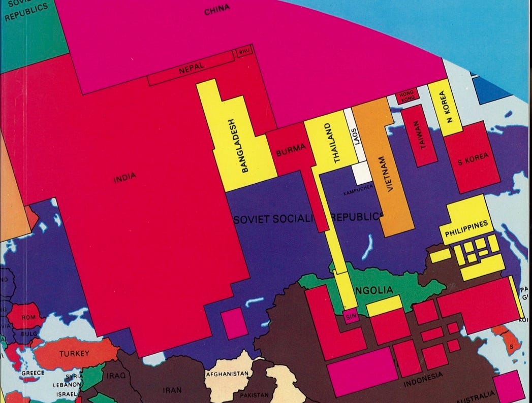
In 1981, Ron Segal, a South African anti-apartheid activist and Michael Kidron, a British cartographer and socialist, published a new kind of world map. The title is unassuming: The State of the World Atlas. But already on the cover, the prim, recognizable nation states of maps past are eclipsed by a formation of sharp blocks reminiscent of formalist art. The pages inside are equally uninterested in “neutral” representations of national borders and natural resources.
One map, “Arms for the Sake of Profit,” reveals the perverse imbalance between the nations exporting weapons and the ones buying them. Another, titled “Bullets and Blackboards,” shows the ratio of soldiers to teachers in each country. Even more provocative (and prescient) is “The Dying Earth,” a visualization of the areas of our planet that are rapidly turning into uninhabitable deserts. “Islands of the Blessed'' depicts various offshore tax havens used by corporations to avoid taxes.
“These are the bad dreams of the modern world,” the New York Times exclaimed in its review of the volume, which they deemed an act of “wit and subversion.” The sentiment was widely shared. Readers and reviewers were shocked to see Segal and Kidron present highly political content in what they considered a sterile, objective form.
Of course, Segal and Kidron weren’t aiming for neutrality. The pages of their atlas, each more astonishing in its revelations than the last, together build an urgent polemic against imperialism, militarism, and global capitalism. More importantly, the radical nature of their maps draws the curtain on the illusion of objectivity underpinning cartography as a whole. All maps are political artifacts, because their creation requires shaping and defining borders, rendering a government’s perspective in diagrams and symbols. Whatever reflection of the world we see in them, it is inevitably a distorted one.
Since The State of the World Atlas, the genre of the poignant data visualization map has become ubiquitous. Voting patterns, coronavirus infections, education levels, crime rates—a staggering amount of data is presented to us through maps, often with the intention of disclosing some profound, unnoticed truth about our country. But real revelations are less common than flashy deceptions. Think of voting maps, which make it look as though the vast majority of Americans are Republican, simply because of the physical size of some red states. Or look at the Reddit page PeopleLiveInCities, which catalogues the many map graphics whose grand messages really just boil down to population density.
Despite these shortcomings, the map’s veneer of objectivity lives on. Even Segal and Kidron, while subjecting their medium to radical critique, also relied on its credibility to bolster their message. Our trust in cartography is likely here to stay, if only because it’s part of a larger hope, both hubristic and naive, that guides us: that the true nature of the world we live in can be perceived, understood, and faithfully reproduced by the minute scope of the human mind.
what we’re looking at
The Speculator in n+1 Vanessa Bee on housing and homes.
The Repressive Politics of Emotional Intelligence in the New Yorker Merve Emre on the failings of self-help doctrine.
Stolen Air in Protean Magazine On asbestos, breath, and labor.
Fevers of Curiosity in The Public Domain Review Matthew Beaumont on Charles Baudelaire, modernity, and convalescence.
Two Lives, Simultaneous and Perfect in Cabinet Magazine Becca Rothfeld on Eric Rohmer’s erotic movies and chaste life.